Blogs
The latest cybersecurity trends, best practices, security vulnerabilities, and more
ARCHIVED STORY
McAfee ATR Thinks in Graphs
By Valentine Mairet · MAR 08, 2021 · 19 MIN READ
0. Introduction
John Lambert, a distinguished researcher specializing in threat intelligence at Microsoft, once said these words that changed perspectives: “Defenders think in lists. Attackers think in graphs.” This is true and, while it remains that way, attackers will win most of the time. However, the true power of graphs does not only reside in constructing them, but also in how we build them and what we do with them. For that, we need to reflect upon the nature of the data and how we can use graphs to make sense of it. I presented on this premise at the MITRE ATT&CKcon Power Hour held in January 2021.
At McAfee Advanced Threat Research (ATR), all threat intelligence relating to current campaigns, potential threats, and past and present attacks, is collated and normalized into a single truth, namely a highly redundant, scalable relational database instance, and disseminated into different categories, including but not limited to MITRE ATT&CK techniques involved, tools used, threat actor responsible, and countries and sectors targeted. This information is a subset of the data available in McAfee MVISION Insights. Much can be learned from looking at historical attack data, but how can we piece all this information together to identify new relationships between threats and attacks? We have been collecting and processing data for many years but identifying patterns quickly and making sense of the complete dataset as a whole has proven to be a real challenge.
In our recent efforts, we have embraced the analysis of threat intelligence using graphical representations. One key takeaway is that it is not just about mapping out intelligence about campaigns and threats into graphs; the strength lies in studying our datasets and applying graph algorithms to answer questions about the data.
In this paper, we provide an extensive description of the dataset derived from the threat intelligence we collect. We establish the methodology applied to validate our dataset and build our graphical representations. We then showcase the results obtained from our research journey as defenders thinking in graphs instead of lists.
The first section explains the kind of data we have at our disposal. The second section describes the goal of our research and the kind of questions we want to answer. Sections 3 and 4 establish the methodology used to process our dataset and to validate that we can actually do something useful with it by using graphs. The fifth section describes the process of building graphs, and Section 6 shows how we use these graphs to answer the questions laid out in Section 2. Section 7 introduces an additional research element to add more granularity to our experiment, and Section 8 shares the limitations of our research and potential ways to compensate for them. Sections 9 and 10 conclude this research with some reflections and proposed future work.
Section 1. Dataset
Our dataset consists of threat intelligence, either collected by or shared with our team, is piped into our internal MISP instance and published to relevant stakeholders. This data concerns information about campaigns, crimeware or nation-state attacks that are currently going on in the world, from potential or reoccurring threat (groups). The data is split into multiple categories used to establish everything we know about the four basic questions of what, who, where, and how. For example, certain attacks on countries in the Middle East have been conducted by the group MuddyWater and have targeted multiple companies from the oil and gas and telecom industries, leveraging spear phishing campaigns. The dataset used for this research is a collection of the answers to these four basic questions about each event.
Section 2. Research Goal
The quantity of data we have makes it almost impossible to make sense in one pass. Information is scattered across hundreds of events, in a database that does not necessarily enable us to connect each piece of information we have in relevant patterns. The goal of this research is to create a methodology for us to quickly connect and visualize information, identify patterns in our data that could reveal trends in, for example, actor behaviour or MITRE technique usage. In this paper, we specifically focus on actor trends and MITRE technique usage.
By providing such tooling, we can answer questions about frequency of actors or techniques, popularity of techniques across actors, and patterns of behaviour in technique usage among actors. These questions are laid out as such:
Frequency
- Which techniques are observed most often?
- Which actors are the most active?
Popularity
- Which techniques are the most common across actors?
Patterns
- Can we identify groups of actors using the same techniques?
- Are actors using techniques in the same way?
These questions are not exhaustive of everything that can be achieved using this methodology, but they reveal an example of what is possible.
Section 3. Methodology
As we are proposing a way to build graphs to make sense of the data we have, we first need to validate our dataset to make sure graphs will deliver something useful. For that, we need to look at expected density and connectivity of the graph. Should our dataset be too dense and overly connected, building graphs will not result in something that can be made sense of.
After establishing that our dataset is graphable, we can focus on how exactly we will graph it. We need to establish what our nodes are and what defines our edges. In this case, we propose two representations: an event-centric view and actor-centric view, respectively taking events and actors as points of reference.
Once we have built our graphs, we investigate different techniques and algorithms to answer the questions laid out in the previous section. This experiment provides us insights into our data, but also into what we are missing from our data that could give us even more information.
The tooling used for this research is an internal tool referred to as Graph Playground that provides users with the possibility to build client-side undirected graphical visualizations in their browser, based on CSV or JSON files. This software also offers a toolbox with analysis techniques and algorithms to be used on the graphs.
Section 4. Dataset Validation
Before building proper graphical representations, we need to assess whether the dataset is a good fit. There are a few metrics that can indicate that the dataset is not necessarily fit for graphs, one of which being the average number of connections (edges) per node:

This average gives us an approximate indication of how many edges per node we can expect. Another useful metric is graph density, defined as the number of edges divided by the total number of possible edges for an undirected simple graph. This is normally calculated using the following formula:

It is a simple equation, but it can already give great insights as to what the graph is going to look like. A graph with high density might be a super connected graph where every node relates to one another in some way. It can be great for visualisation but will not provide us with anything useful when it comes to identifying patterns or differentiating between the different components of the graph.
Section 5. Building Graphs
Based on the data at hand, one intuitive way to build graphs is using a threat event as a central node and connected nodes that represent MITRE techniques, threat actors, tools, countries, and sectors to that event node.
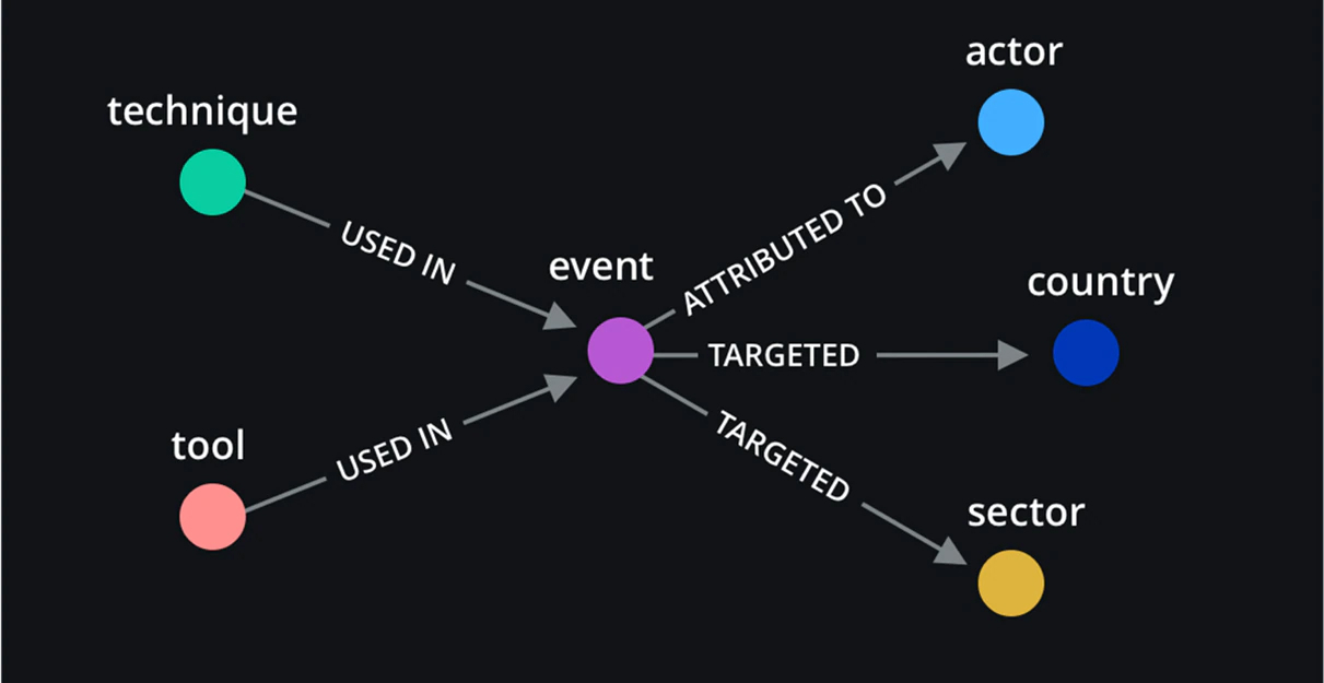
Figure 1 depicts the initial graphical representation using each event and associated metadata registered in MISP. Relationships between event nodes and other nodes are defined as follows: techniques and tools are used in one event that is attributed to a specific actor and involves a threat or attack on certain countries and sectors.
Based on the representation and our dataset, the number of nodes obtained is |N| = 1,359 and the total number of edges is |E| = 12,327. In our case, because only event nodes are connected to other nodes, if we want to check for the average number of edges per node, we need to look specifically at event nodes. In the obtained graph g, this average is equal to:

To calculate the density, we also need to account for the fact that only event nodes have connections. The density of the obtained graph g is then equal to:

Density always results in a number between 0 and 1. With an average of 18 edges per event node and a graph density of 0.053, we can expect the resulting graph to be relatively sparse.
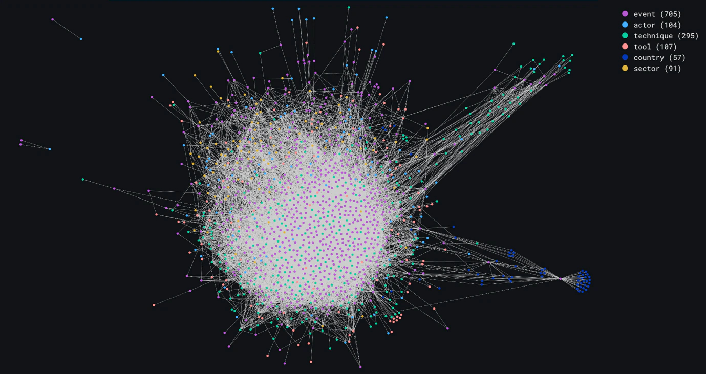
The full graph obtained with this representation in Figure 2, against our predictions, looks much denser than expected. It has an obvious central cluster that is busy with nodes that are highly interconnected, consisting mostly of event and technique nodes. In Figure 3, we discard MITRE technique nodes, leaving event, country, sector, and tool nodes, to demonstrate where the low-density calculation comes from.
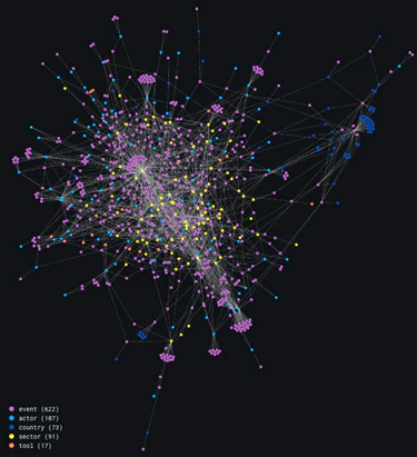
Removing MITRE technique nodes results in a much less dense graph. This may be an indication that some event and technique nodes are highly interconnected, meaning there may be a lot of overlap between events and techniques used.
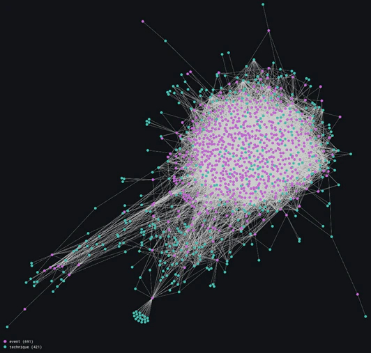
Figure 4 proves this statement by showing us a large cluster of interconnected event and technique nodes. There is a set of events that all appear to be using the same technique. It would be interesting to isolate this cluster and take note of exactly which techniques these are, but this research takes us down another road.
Based on the data we have, which mostly consists of events relating to crimeware, we choose to disregard country and sector information in our graphical analyses. This is because these campaigns are most often sector and country-agnostic, based on historical observation. Therefore, we proceed without country and sector data. This allows us to perform some noise reduction, keeping events as points of reference.
We can also take this a step further and collapse event nodes to switch the focus to actor nodes with regard to tools and MITRE techniques used. This results in two different representations derived from the original graph.
Section 5.1 Event-centric View
Removing country and sector nodes, we are left with event nodes connected to actor, technique, and tool nodes. Figure 5 illustrates this representation.
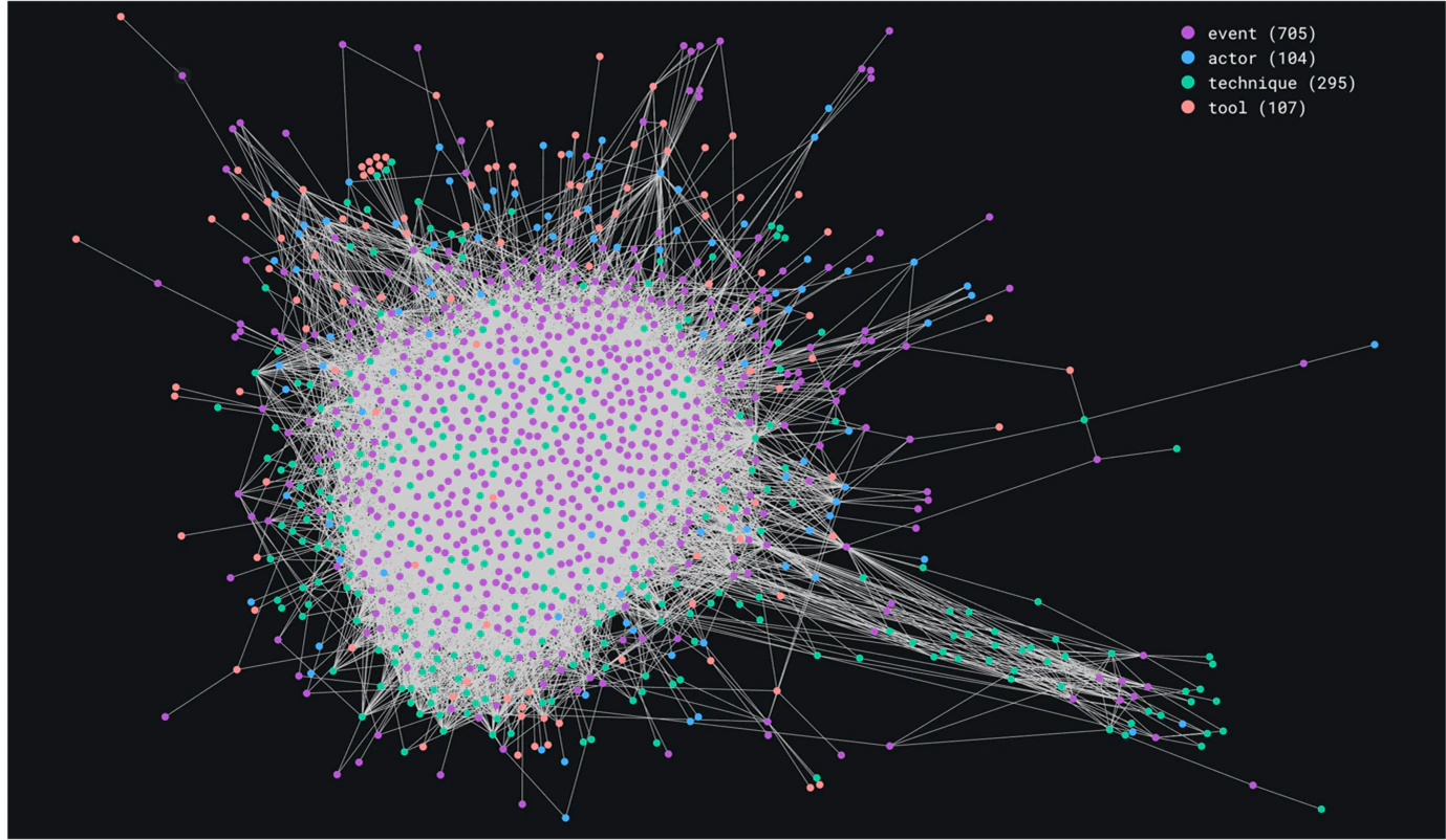
This resulting representation is an event-centric view, and it can help us answer specific questions about frequency of actors involved, techniques or tools used during recorded attacks and campaigns.
The graph in Figure 6 is very similar to the original one in Figure 2, but the noise that is not of real interest at this stage has been removed, so that we can really focus on events regarding actors, techniques, and tools.
Section 5.2 Actor-centric View
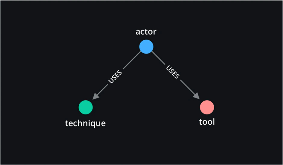
Another possible representation, because the data we have about countries and sectors is very sparse, is to center the graph around actor nodes, connected to techniques and tools.

Figure 7 establishes the relationship between the three remaining nodes: actor, technique, and tools. The resulting graph is displayed in Figure 8.
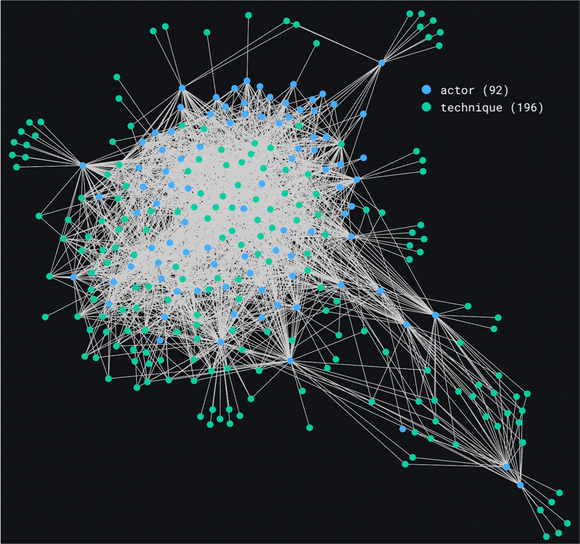
These two ways to build graphs based on our data provide an event-centric view and an actor-centric view and can be used to answer different questions about the gathered intelligence.
Section 6. Using the Graphs
Based on the two generated views for our data, we demonstrate how certain algorithms and graph-related techniques can be used to answer the questions posed in Section 2. Each view provides insights on frequency, popularity, or pattern questions.
Section 6.1 Frequency Analysis
Which techniques are observed most often?
To answer questions about the frequency of techniques used, we need to take the event-centric view, because we are directly addressing how often we have observed techniques being used. Therefore, we take this view and look at the degree of nodes in the graph. Nodes with a high degree are nodes with more connections. A MITRE technique node with a very high degree is a node that is connected to a high number of events.
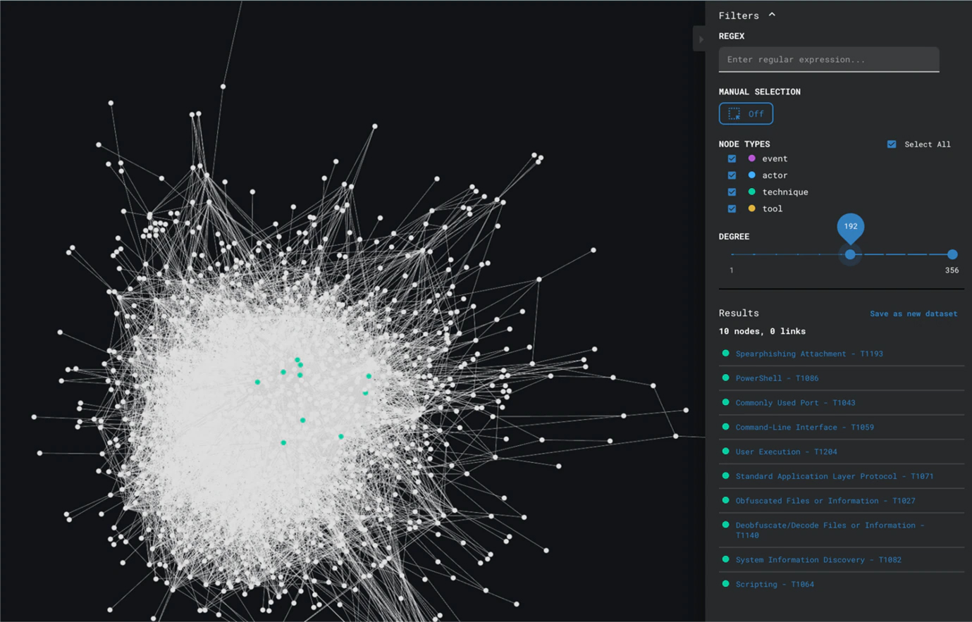
Figure 9 shows us the application of degree analysis on the event-centric view, revealing techniques like Spearphishing Attachment and Obfuscated Files or Information as the most often observed techniques.
Which actors are the most active?
The same degree analysis can be used on this view to identify which actors have most often been recorded.
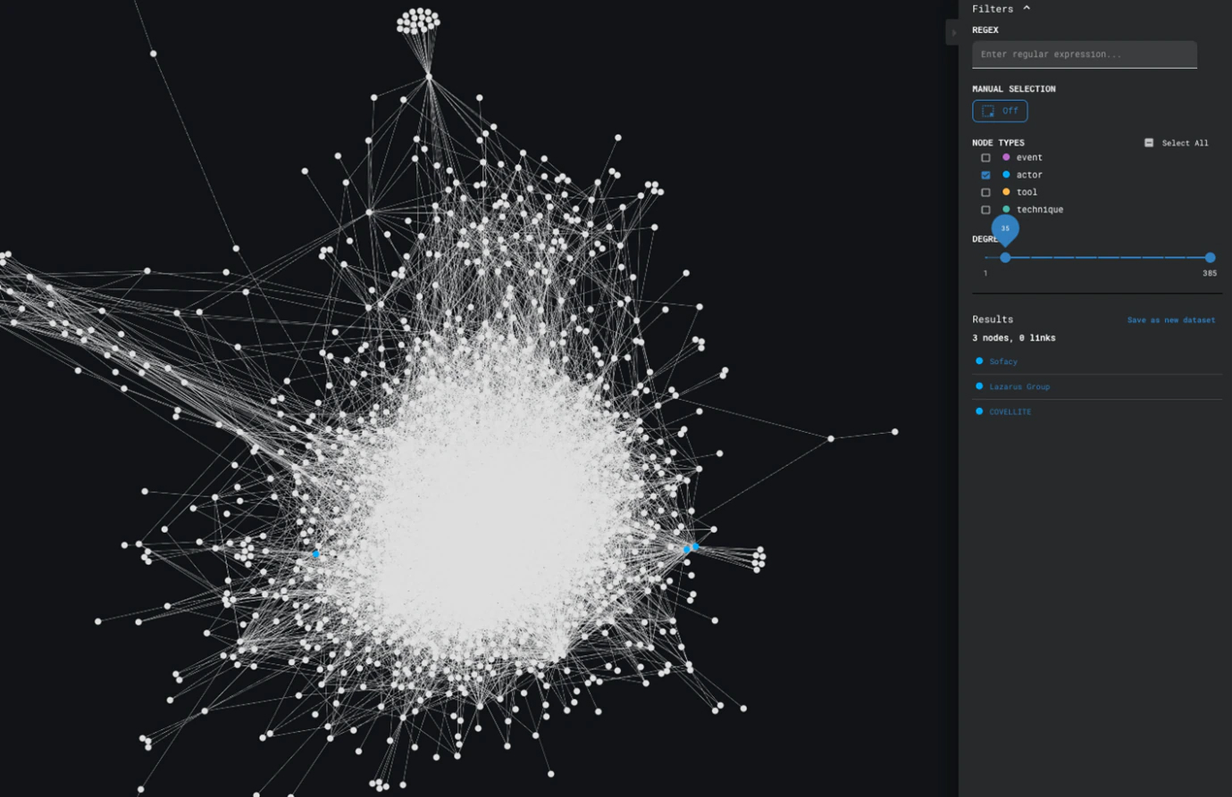
Based on the results displayed in Figure 10, Sofacy, Lazarus Group, and COVELLITE are the most recorded actors across our data.
Section 6.2 Popularity Analysis
Which techniques are the most common across actors?
To answer questions about popularity of techniques across actors, we need to look at the actor-centric view, because it will show us how techniques and actors relate to one another. While degree analysis would also work, we can make use of centrality algorithms that measure how much control a certain node has over a network, or in other terms: how popular a certain node is.
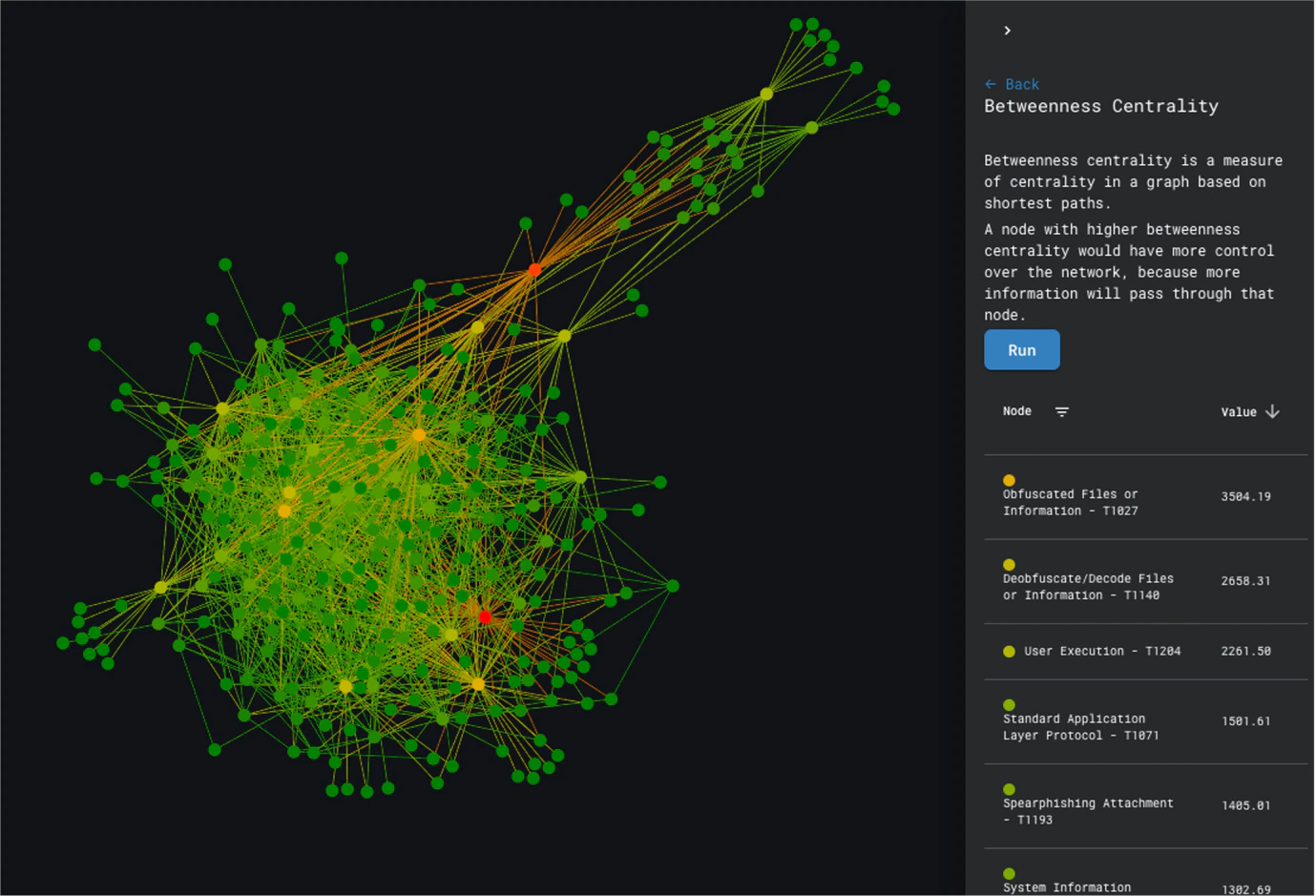
Running centrality algorithms on the graph shows us that Obfuscated Files or Information and User Execution are two of the most popular techniques observed across actors.
6.3 Patterns Identification
Can we identify groups of actors using the same techniques?
The keyword here is groups of actors, which insinuates that we are looking for clusters. To identify groups of actors who use the same techniques, we can attempt to use clustering algorithms to isolate actors who behave the same way. We need to apply these algorithms on the actor-centric view. However, we also see that our actor-centric view in Figure 8 has quite a dense bundle of nodes, and this could make the building of clusters more difficult.
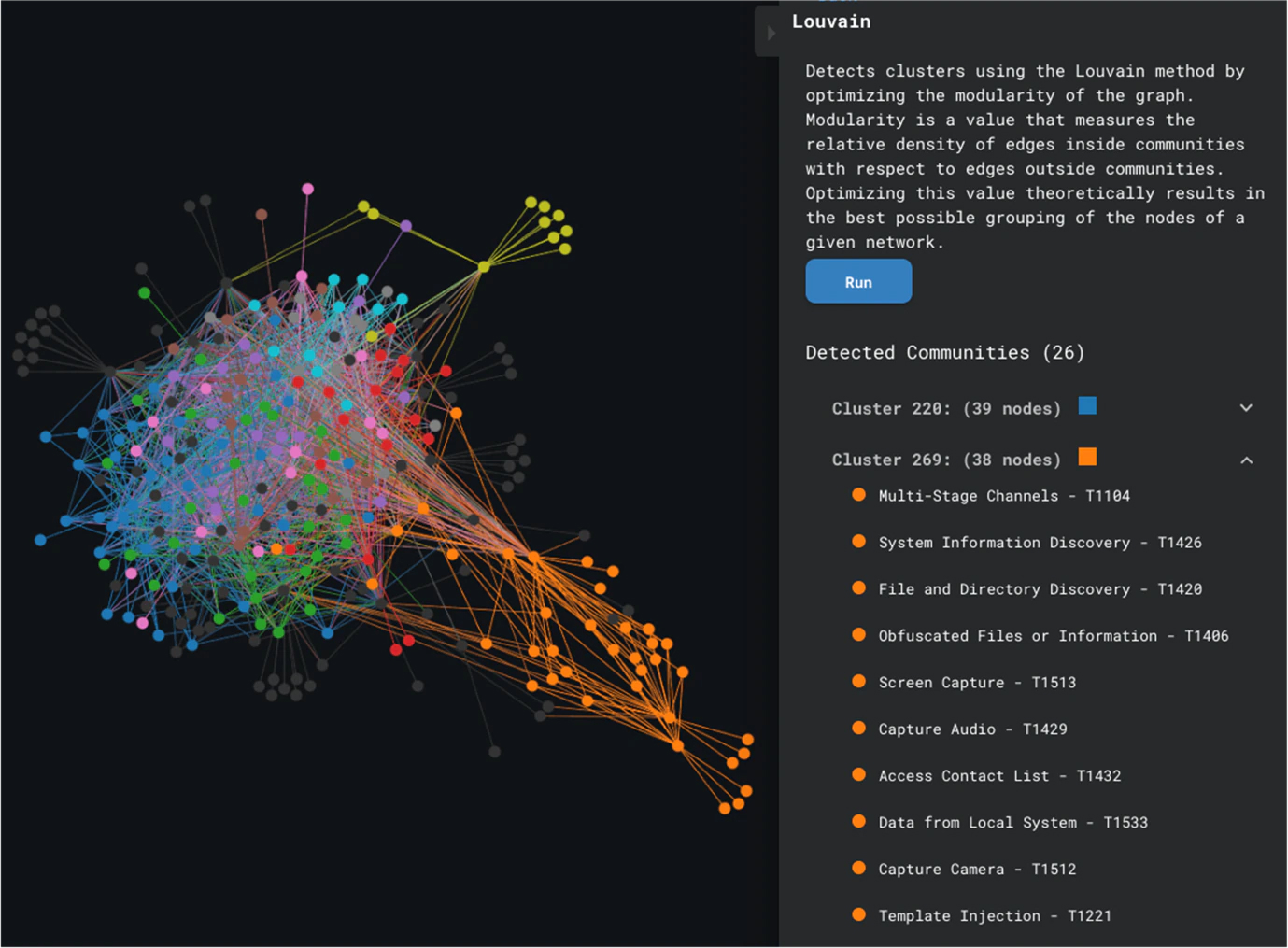
Louvain Clustering is a community detection technique that builds clusters based on edge density; Figure 12 shows us the results of running this algorithm. We see that it was possible to build some clusters, with a clear distinction between the orange cluster and the bundle of nodes, but it is not possible to verify how accurate our clusters are, because of the density of the subgraph where all the nodes seem to be interconnected.
We can draw two conclusions from this:
- A lot of actors use the same techniques.
- We need to introduce additional information if we want to dismember the dense bundle of nodes.
This takes us to the last important question:
Are actors using techniques in the same way?
With the information currently at our disposal, we cannot really assess whether a technique was used in the same way. It would be ideal to specify how an actor used a certain technique and encode that into our graphs. In the next section, we introduce an additional element to hopefully provide more granularity so we can better differentiate actors.
Section 7. Introducing Killchain Information
To provide more granularity and hopefully answer the question about actors using techniques in the same way, we embed killchain step information into our graphs. A certain attack can be used for multiple killchain steps. We believe that adding killchain step information to specify where an attack is used can help us better differentiate between actors.
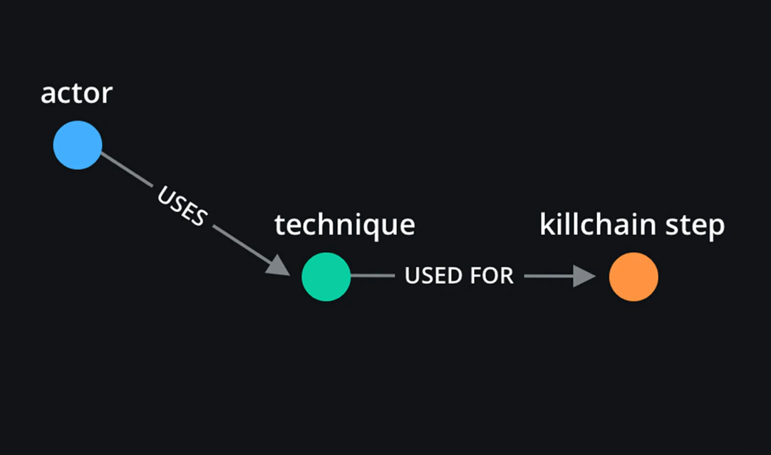
This is a slight modification that occurs on our actor-centric view. The resulting graph should provide us with more granularity with regards to how a technique, that is present at multiple steps, was really used.
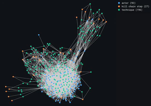
The resulting graph displayed in Figure 14 is, for lack of a better word, disappointing. That is because killchain step information has not provided us with more granularity, which in turn is because of our dataset. Unfortunately, MISP does not let users specify when a technique is used in one specific step of the killchain, if that technique can occur in multiple steps. When recording an observed MITRE technique that can occur in multiple steps, all steps will be recorded with that technique.
Section 8. Limitations
MISP provides granularity in terms of MITRE sub-techniques, but there is no built-in differentiation on the killchain steps. It is not yet possible to specify exactly at which step a technique present in multiple steps is used. This removes a certain level of granularity that could be useful in the actor-centric view to differentiate even more between actors. If such differentiation existed, the actor-centric view could be collapsed into:

Additionally, based on the data at hand, it is clear that actors tend to use the same techniques overall. The question of whether using MITRE techniques to differentiate between actors is actually useful then comes to mind. Perhaps it can be used to discard some noticeably different actors, but not most?
Limitations of our research also lie in the tooling used. The Graph Playground is great for quick analyses, but more extensive manipulations and work would require a more malleable engine.
Lastly, our research focused on MISP events, threat actors, and MITRE techniques. While most questions about frequency, popularity, and pattern recognition can be answered the same way for tools, and even country and sector, the list of what is achievable with graphs is definitely not exhaustive.
Section 9. Conclusion
Building graphs the right way helps us visualize our large dataset almost instantly, and it helps us make sense of the data we see. In our case, right means the way that is most relevant to our purpose. By having sensical and relevant representations, we can connect cyber threats, campaigns, and attacks to threat actors involved, MITRE techniques used, and more.
Graphical representations are not just about piping all our data into one visualization. We need to think of how we should build our graphs to get the most out of them, while attempting to maintain satisfactory performance when scaling those graphs. Graphs with thousands of nodes often take long to render, depending on the visualization engine. The Graph Playground generates graphs from a file on the client-side, in the browser. This makes the generation incredibly fast.
Certain aspects of our research require an event-centric view, while others may, for example, require an actor-centric view. We also need to assess whether building graphs is useful in the first place. Highly dense and connected data will result in graphs that cannot be used for anything particularly interesting for our analyses of threat intelligence.
Our research has proven fruitful in the sense that much can be gained from translating our dataset to adequate representations. However, we lack a certain granularity-level that could help us differentiate between certain aspects of our data even more.
To add to John Lambert’s quote, “Defenders think in lists. Attackers think in graphs. And Threat Intelligence analysts build proper graphs and exhaustively use them.”
Section 10. Future Work
As mentioned, we have encountered a granularity issue that is worth looking into for future research. It would be interesting to consider incorporating analysis results from EDR engines, to isolate where a specific MITRE ATT&CK technique was used. This would provide much deeper insights and potentially even more data we can include in our visualizations. Should we succeed and process this information into our graphs, we would be able to better differentiate between actors that otherwise seem to behave the same.
We can also shift our perspective and include country and sector information but, for that, we need to exclude all crimeware-related events that are sector or country-agnostic and include only campaigns that have specific targets. Only then will such representation be useful for further analysis.
Another point worth mentioning for future work would be to consider incorporating additional resources. The Intezer OST Map, which is open source, provides insights on tools used by threat actors for well-known campaigns. It would be interesting to merge the Intezer dataset with our own and experiment with our graph representations based on this new dataset.
RECENT NEWS
-
Apr 08, 2026
Trellix prevents enterprise data exposure in sanctioned and shadow AI
-
Mar 02, 2026
Trellix strengthens executive leadership team to accelerate cyber resilience vision
-
Feb 10, 2026
Trellix SecondSight actionable threat hunting strengthens cyber resilience
-
Dec 16, 2025
Trellix NDR Strengthens OT-IT Security Convergence
-
Dec 11, 2025
Trellix Finds 97% of CISOs Agree Hybrid Infrastructure Provides Greater Resilience
RECENT STORIES
Featured Content
Get the latest
Stay up to date with the latest cybersecurity trends, best practices, security vulnerabilities, and so much more.
Zero spam. Unsubscribe at any time.